Choosing your colors
Hello friend!
The other day I re-discovered my love for my quinacridone red watercolor paint 🥰 and I thought it would be worth it to share this story with you.
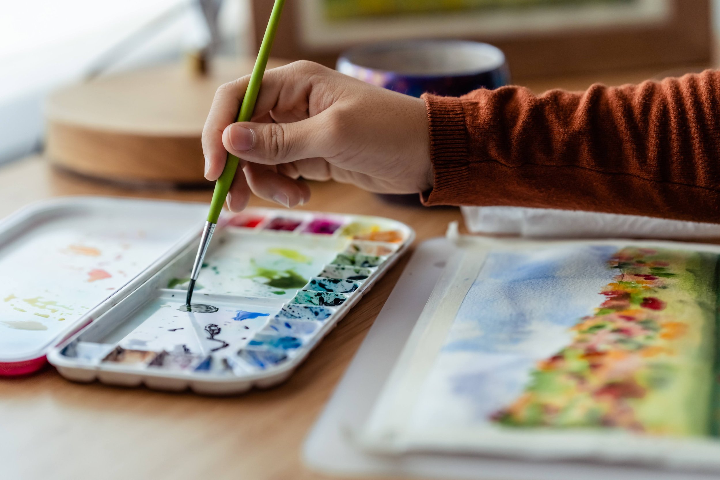
In this post, we'll talk about everything I learnt so far about choosing your own watercolor palette, this means, to choose a set of colors that you’ll regularly use in your paintings, no matter if you are a beginner or a more experienced artist.
If you read My Story page, you probably know I started to dive into the magical world of watercolors by binge watching watercolor YouTube videos. But one day, I was decided to stop watching and start painting! I was so excited! but also a bit nervous… because a very relevant question came to my mind…
Which set of colors should I buy to start? 😱🎨
If you already paint with watercolors, I'm pretty sure you had a similar question at the beginning of your artistic journey. Luckily, (if this doesn't overwhelm you 🤔) there are thousands of reviews online to give yourself a good idea about which brands offer professional quality paints, artist quality paints, granulating paints, etc.
However, when you start informing yourself about all the different brands, even if they are explained so anyone can understand the technical differences between them, we are all lacking something very obvious, but very important to make the best choice for you, and that is: Your very personal experience.
Don't get me wrong, it is absolutely normal that you lack experience when you buy your very first set of watercolor paints! But that's what I find interesting about this topic.
Most of the artists I have followed online throughout the years offer their advice on which set of colors you need to buy to start with this medium, of course, their advice is needed and I think it's very valid but I also think that finding the perfect palette, for your very first palette, it's not that important.
While some art teachers will make sure you only buy a few colors so you can learn how to mix them, others will tell you that you need a few more colors than the primaries in order to not spend all your efforts in mixing them but more focused on the painting, or that you need a versatile palette with a lot of colors to paint very different subjects, or that it's better to not spend a lot of money at the beginning on colors that you would not use... and guess what…
None of them are wrong
I remember spending SO much time on researching which palette to buy when I started… and two days ago, after almost six years painting with watercolors I realized, it was not that important!!!
The specific colors you use in your palette, will depend on many variables! Some of them are:
The topic you will paint: landscapes, portraits, animals, flowers, etc
The kind of art you will make: hyperrealism, abstract, figurative, etc
The colors that make you happy: warm colors, cool colors, neutrals, purples, reds, pinks, violets, etc
The feeling you want to transmit to others when they look at your painting
The properties of the paint that fit your art: granulating, neon, vibrant, moody, etc
And from my point of view, we don't know all those variables when we start painting… but also we don't need to.
My watercolor palette progression
In case you are curious, I started with one of these Cotman Sets and I bought a bigger one because it made me really happy to have many colors to explore and experiment!
Now that I have more experience, I think their quality is pretty decent to be student quality paint, but after some time using them, I remember I switched to a set tubes of holbein professional watercolors that were a birthday gift and….
O - M - G
The color vibrancy, the cremosity and consistency of the paint, the ease of reactivating the dried paint, how beautiful the colors mixed and flowed in the palette, how easy it was to take color from the pan, etc made me jump to a whole new level of joy! I also found some amazing and favorite colors I couldn't find in the previous brand I used, like: marine blue, shell pink, cobalt green, lavender, etc.
Some years after that, I decided to invest in some handmade watercolor paints and again I jumped into another level of exploration, fun and satisfaction.
It was amazing to use colors that other paint maker artists decided to make! the quality of the paint, the amount of pigment, the original colors curated by the paintmaker, the care that goes into each pan, the freshly made paint created just for you… today, they continue to be like little pieces of art that other people use to create more art! 🥰 Again, I found some new favorite colors I didn't know about before
Some months / years after that, I took some online classes, and decided to buy one or two tubes of watercolor paints the teacher suggested and I learnt so many things in that period! As an example:
I absolutely hate cerulean blue as sky color -> which made me research more about alternative blues
Blanca Alvarez made me discover the amazing grey you can mix with perylene violet, cobalt blue and a yellower version of burnt sienna.
The paints containing opaque pigments or white pigment (which are often turned away for not being pure colors), are very useful to overpower any other wet paint in a piece, due to its weight, for example the colorful clouds in a sunset.
My most preferred neutral is neutral tint and not payne's grey as I thought at the beginning.
Indanthrone blue is my favorite single pigment blue.
Bright reds, such as pyrrol red, are one of the colors I use the least in my paintings.
What I'm trying to say here is that, as I continued to develop my artistic journey, I discovered many new colors that are super interesting and that today belong to both my studio and my plein air painting palette.
And the decision to add those colors could only be made after all the experience I gathered through the years. The colors of my palette now have nothing to do with the colors I had when I started painting.
But you didn't tell any story about quinacridone red yet …
I think this story only made sense at the very end of this blog post, so it can be understood in the same context.
At some point at the beginning of my art journey I "learnt“ that I should always have quinacridone red in my palette because it is a color that mixes very well with other colors, that is very pure, that is very vibrant, that is so versatile!
However, (and I'm not joking although you may think I am 🤣) I didn't like that it was called quinacridone RED but when you use the color … it is more like a warm pink!!!!!!!! What on earth?????
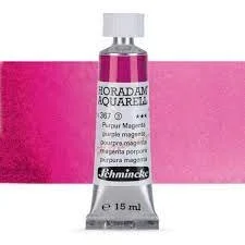
I decided it was a very confusing color that didn’t merit any place in my palette, so I removed it and instead I started using magenta from Schmincke.
Of course, before removing it from my palette, I made some color swatches to compare them and I liked more the magenta anyway, so it ended up in my palette 🙃
At that point, for me, the magenta color had nothing to hide… it was really as you would imagine a magenta would be… so I continued using magenta during months even years, but my subconscious started to realize at some point that something in my paintings was off.
Until I rescued from my drawer a half pan of quinacridone red last week and ….
🎈 🎉 B O O M 🎉 🎈
my brain made the connection and realized the WHY behind everything!!!!!
My pinks were never truly warm, even when mixed with a warm color, and even when I needed them to be, but even if now looks obvious, I never made the connection until that very moment!!!
What a discovery, my friend!
At beginning, I felt a bit bad because of all the time "I lost” with this magenta color, but at the same time I don't have any regrets because I feel I understood by practicing why that color was important, and how it compares to a different type of pink such as magenta. I'm so proud and happy that it was my own discovery and not only based on other's artists very valid opinion.
And who knows, maybe for your style of painting, maybe because of the rest of the colors you have in your palette, magenta would have been the right choice for you…
But you will only know 100% sure when you try, when you explore, when you make mistakes, when you try and when you make those connections yourself !!!
With this post, I hope I encouraged you (at least a little bit) to choose colors in your palette that make you happy, and that you allow yourself to discover new colors in your artistic journey as you learn and practice without regrets!!
Do you have any interesting stories about your watercolor palettes?? I would love to know them!! I would love that you write a comment below or DM me on instagram :)
Hello, I’m Afri!
I am a watercolor and gouache artist in love with nature and landscapes. My goal is to inspire you to unleash your creativity and to transmit you how painting outside could be good for your soul! :)
Search in the blog


A sketchbook it's just paper, glue and a cover.